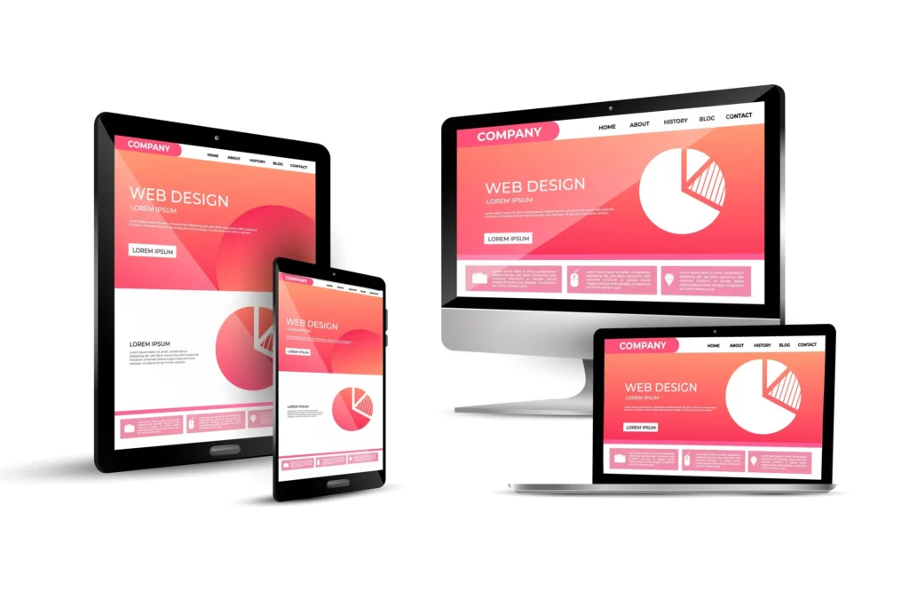
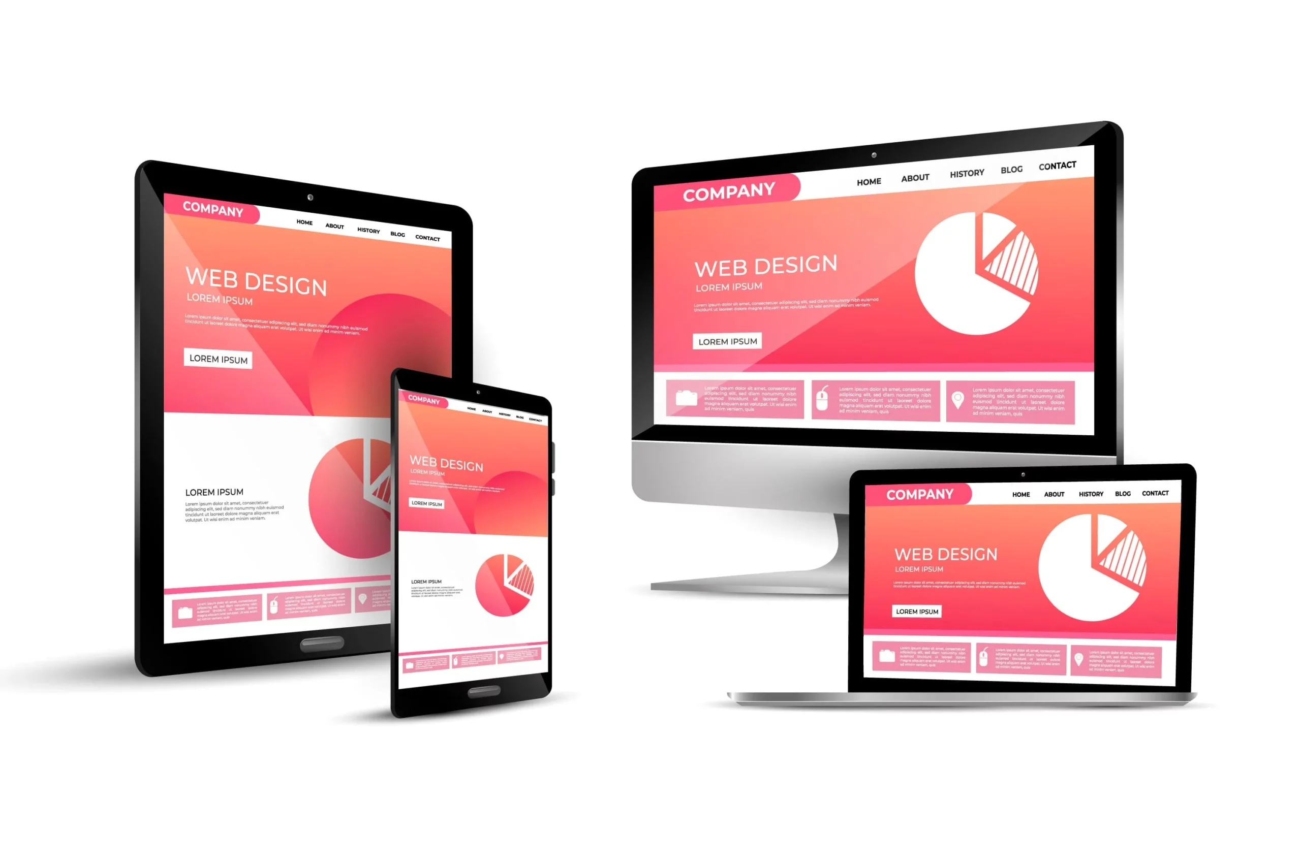
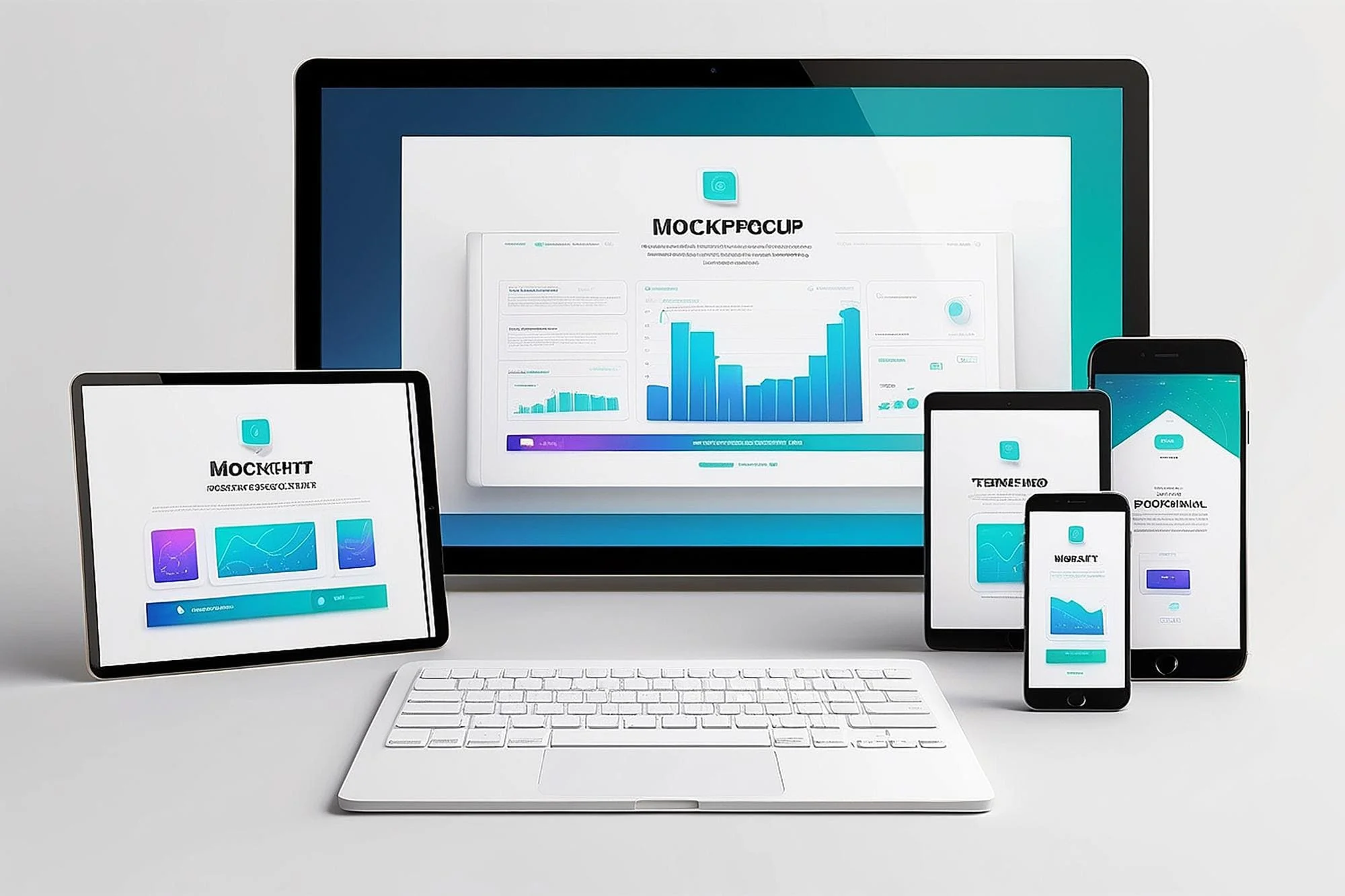
In today’s digital age, where smartphones, tablets, and various other devices dominate our online interactions, having a website that adapts seamlessly to different screen sizes and resolutions is no longer a luxury—it’s a necessity. Enter responsive design, a revolutionary approach to web design that prioritizes user experience across all devices.
Understanding Responsive Design
Responsive design is a design technique that ensures a website’s layout and content dynamically adjust based on the screen size and orientation of the device being used. This means that whether a visitor accesses your website from a desktop computer, a smartphone, or a tablet, they will have an optimal viewing experience without having to pinch, zoom, or scroll excessively.
Enhancing User Experience
The primary goal of responsive design is to enhance user experience (UX) by providing a consistent and intuitive browsing experience across all devices. By ensuring that your website looks and functions seamlessly on any device, you can keep visitors engaged and encourage them to explore your content further.
Key Benefits of Responsive Design
Improved Accessibility: Responsive design ensures that your website is accessible to users on all devices, including those with smaller screens or accessibility needs.
Better SEO Performance: Google and other search engines prioritize mobile-friendly websites in their search results, meaning that responsive design can improve your website’s search engine ranking and visibility.
Increased Conversions: A responsive website reduces bounce rates and increases the likelihood of visitors staying on your site longer, ultimately leading to higher conversion rates.
Cost-Effectiveness: Instead of maintaining separate desktop and mobile versions of your website, responsive design allows you to manage one site, reducing development and maintenance costs in the long run.
Implementing Responsive Design
Implementing responsive design requires careful planning and execution. Here are some key considerations:
Flexible Grid Layouts: Use fluid grid layouts that adjust proportionally based on screen size, allowing content to resize and reflow accordingly.
Media Queries: Utilize CSS media queries to apply specific styles based on device characteristics such as screen width, resolution, and orientation.
Optimized Images: Optimize images for fast loading times on mobile devices without sacrificing quality. Consider using responsive images that adapt to different screen resolutions.
User Testing: Regularly test your website across various devices and browsers to ensure a consistent and seamless user experience.
Conclusion
In today’s multi-device world, responsive design has become a cornerstone of effective web design. By prioritizing user experience and ensuring accessibility across all devices, responsive design not only improves engagement and conversions but also helps future-proof your website against evolving technology trends. Embrace the power of responsive design and elevate your website’s user experience to new heights.
Boost User Experience with Expert Responsive Web Design in Thornhill
Responsive design ensures your website delivers an optimal experience across all devices. Our Web Design Thornhill services focus on creating mobile-friendly, fast-loading websites that not only look great but also enhance usability, helping your users engage with your content seamlessly.